

This post is the second in a series about identifying and selecting quality children's books for the preschool set. Part 1 is here. Parts 2b, 3, 4, and 5 will follow in the next couple of weeks ... or longer. These posts are likely going to be long-winded so I want to give my readers lots of time off in-between.
Copyright caveat: I use a lot of pictures in this post most of which are copyright protected. I did not scan any images into my computer nor upload them. I am simply drawing in images from elsewhere on the web. My purpose in doing so is solely to promote the books depicted. I have not used images from books I do not recommend. I also do not derive any income (monetary or goods and services from my writing); as such I am in no way profiting from the intellectual property of others. Having said all of that, I will remove all embedded images except for book covers from this post and replace them with external links in 7 days time. In the interim, should I receive any requests from copyright holders to remove images from this post, I will do so immediately.
On with the show...
What is the role of pictures in books for young children? Is it simply to illustrate the text? Having spent so many years as readers, we adults tend to privilege text at the expense of illustration. Library users are always asking me for a good story, a funny story, for a tale about trucks, ballerinas, or animals, for a book that teaches manners or what have you, for a book that will help a child learn to read, or one that fosters a desired "learning outcome" (now there's an expression that makes me want to puke). I only rarely have users come to me looking for a certain style of art or expressing a desire to teach visual literacy.
I remember reading simple vocabulary books to Miss M in that year where language hit her like a tidal wave. Words. Words. Words. Words were what she needed and words were what I gave her. Invariably, I found my word-centred self pointing to the black squiggle of text as I was reading and not to the picture she was looking at. Young children see the world differently, though. They acquire visual literacy long before they can decipher those black marks on the page. Good children's writers and illustrators know this. Good children's writers and illustrators design their books to cater to a child's need for aural, verbal, visual and, eventually, written literacy.
The most common form of book for young children is the picture book: 32 pages that most often contain text and pictures, although the former can be absent. In a good picture book, the text and art complement each other. I use the word "complement" on purpose, as it comes from the root "complete." In a good picture book neither the text nor art is complete without the other. Oftentimes the story can stand alone in a less rich form, but many innovative picture books depend on their illustrations to tell part or all of the story.
Take for example, Pat Hutchin's Rosie's Walk published in 1967. It is usually acknowledged as the first picture book in which the words deliberately leave out part of the story. The words tell in brief, literal detail what happens when Rosie, the hen, goes for a walk around the barnyard. Only the illustrations show what happens to the ill-fated fox who chooses to follow her. Page after page, the fox gets his comeuppance and Rosie? Well, she gets "back in time for dinner". End of story.
IMAGE LINK
This style of integrated storytelling is quite prevalent in contemporary picture books. One of my favourite renderings of it is the Caldecott medal-winning Officer Buckle and Gloria by Peggy Rathmann.
I wish I could find pictures online to show you Gloria the police dog's outlandish enactments of Officer Buckle's safety tips. Better yet, I wish I could show you the climax illustration when Officer Buckle realizes he's been had by his best friend. You'll have to go check it out to see for yourself if you haven't read it already.
How does the 10 dollar expression "visual literacy" differ from the 10 cent version "looking at pictures"? A lot can be said for how pictures themselves invite the reader in and promote an interpretive framework. A few basic design principles provide the foundation for all visual communication. How these principles are employed by the artist acting in tandem with the writer determine the degree of engagement a reader can have with a picture book. To explain, I am relying on the The On-line Visual Literacy Project at Ponoma College. The article, which outlines the 11 fundamental components of design, is well-researched and well-cited. I highly recommend it, should you wish to pursue these issues further (and, perhaps, catch all my errors in interpretation). I plan to tackle the basic design components here by dividing them into four groupings and looking at those groupings through the lens of picture book illustration. They are:
The building blocks (dot, line, shape, and texture)
Movement (motion and direction)
Colour (hue, value, and saturation), and
Perspective (scale and dimension)
The rest of today's post will look at the building blocks. My next post will cover movement, colour and perspective.
The Building Blocks
The dot and the line are fundamental to all artistic creation. The dot is a stable, grounding force: a moon in the sky or an object in the distance that your eye is drawn to. Lines create while dots merely are. The exception to this rule is in contemporary visual technology whereby all images are expressed through a series of dots. The genius of Roy Lichtenstein was to turn our way of looking at a screen or a comic book back on us and to make us aware of the visual make-up of new technology as a series of dots.
IMAGE LINK
The line creates all movement, direction, and perspective. The line, when used cleverly, is an object lesson in how art works.
IMAGE LINK
IMAGE LINK
Straight lines, particularly diagonals suggest activity. Curved lines sooth and rock with a gentle motion.
From lines, shape emerges. The comforting, rolling circle is a big ol' dot that depends upon line for its movement.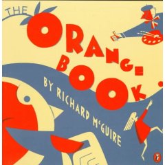 Richard McGuire's Orange Book, 1993
IMAGE LINK
Kevin Henkes' Caldecott-winning Kitten's First Full Moon, 2004. Notice the grounding circles in the moon, in the fireflies and in the kitten herself. Then notice how the angled line of the tail directs your eye to the moon so that we look at they very thing that has caught the kitten's attention.
The claustrophobic square and rectangle...
IMAGE LINK
...with their promise of escape.
IMAGE LINK
Is it any wonder that Sendak's masterpiece, Where the Wild Things Are, begins in Max's house bounded by a white, square frame on the page. With each page, the frame gets smaller and smaller until Max sails off to the land of the wild things. At this point, the frame disappears altogether and the image becomes a full-page bleed. In fact, the wild things themselves would burst the bounds of the book if they could.
IMAGE LINK
The manic triangle is all lines and angles scarcely bound. It keeps your eyes always moving.
IMAGE LINK
IMAGE LINK
Triangles, because they contain at least two diagonal lines, represent energy and movement, particularly when they are sitting on their angles instead of their base.
An aside:
If your child has moved past the random scribble in fine motor skill development (mine has not), check out the books of Ed Emberly. Alternatively, go to his website where you will find countless drawing exercises that let kids turn the dot, the line, and the fundamental shapes into just about any object under the sun. Voila: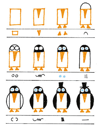
Child readers discover texture early on: pat the bunny, pop-up, and crinkle-paper books abound in our tactile, catered-to-baby culture. An image does not need faux fur or sandpaper to convey texture, though, and different illustration techniques can often make a one-dimensional image seem 3D.
IMAGE LINK
Canadian Barbara Reid models her illustrations out of clay before they are transferred to paper for printing. This illustration is from Effie, 1999. The computer screen does not do justice to the level of detail in her art. Take, for example, this image from her version of Noah's ark entitled Two By Two, 1992.
IMAGE LINK
If you haven't read a book with Barbara Reid illustrations, hurry out and do so immediately. As an aside, there is a wonderful detail in this illustration: Noah's wife (dressed in green on the middle deck) has just realized that she's stepped in dung and is looking at the bottom of her shoe in disgust.
Wallace Edwards supplements detail with competing colours and patterns to create a textured look.  from Wallace Edwards' Alphabeasts, 2002.
Eric Carle creates texture by using multi-coloured tissue paper in his art. It's always fun to read a bunch of Carle books and then have your kids create tissue paper art. You can give them colouring page image outlines, if you want, and then let them do the rest.
IMAGE LINK
Barry Moser, Chris VanAllsburg, and Christopher Bing have all used woodcuts or pen-and-ink in the style of woodcuts to create texture.
IMAGE LINK
______________________________
OK, out of 11 design fundamentals, I have now covered 4 and the post is waaaay long. Stay tuned for part b in a few days. In the meantime, ask yourself as you read stories to your kids, "does this picture add something of value to the book? Does it create mood, set tone, establish character? Is the image energetic or peaceful? Does it extend the mind in interesting ways beyond what is conveyed by the words on the page? How does it accomplish its task?"
Now here's a question for all of you: What picture book or illustrator's style do you like in particular and why? Don't be shy to answer. I love nothing more than learning about what makes children's books work. All other comments or discussion points are welcome as well.
Showing posts with label picture book reviews. Show all posts
Showing posts with label picture book reviews. Show all posts
Tuesday, November 04, 2008
How to know when a book is superb: pictures edition, part 1

Subscribe to:
Posts (Atom)


