

At long last, a continuation in my children's book series. To recap: this series is divided into five parts consisting of 6 posts.
Part One talked about strategies for using your local library to find quality children's books.
Part Two (A) discussed several design fundamentals that contribute to superb illustration in picture books.
Part Two (B) (this post) will talk about several more design fundamentals that contribute to superb illustration in picture books.
Part Three will explore language and literary techniques used in quality writing for children.
Part Four will provide a genre summary and list recommended titles in each genre.
Part Five will list 100 excellent author/illustrators for children with either links or a brief overview of their works/style.
A repeat of my copyright caveat: I use a lot of pictures in this post most of which are copyright protected. I did not scan any images into my computer nor upload them. I am simply drawing in images from elsewhere on the web. My purpose in doing so is solely to promote the books depicted. I have not used images from books I do not recommend. I also do not derive any income (monetary or goods and services from my writing); as such I am in no way profiting from the intellectual property of others. Having said all of that, I will remove all embedded images except for book covers from this post and replace them with external links in 7 days time. In the interim, should I receive any requests from copyright holders to remove images from this post, I will do so immediately.
And now, to pick up where we left off...
You may recall that I am relying on The On-line Visual Literacy Project at Ponoma College for my terms of reference in defining the 11 basic design components of all visual communication. I have grouped these components into 4 broad categories.
The building blocks (dot, line, shape, and texture) (the subject of my last post in this series)
Movement (motion and direction)
Colour (hue, value, and saturation), and
Perspective (scale and dimension)
The rest of today's post will look at movement, colour, and perspective.
From utter stillness, motion emerges: Image Link (note: I've added the external links to the images just in case you want to see a larger version of any of them.)
Rob Gonsalves holds stillness and motion in tandem in this surreal illustration featured in Imagine a Night (2003). His paintings have been pulled together in three separate picture books, Imagine a Night, Imagine a Day, and Imagine a Place, all with text provided by Sarah L. Thomson. The text doesn't shine so well as the illustrations but the books are stunning eye candy for all ages.
Picture book artists create motion on a fixed, 2-dimensional plane by using using multiple techniques, and, unlike the Gonsalves illustration would you have you believe, the motion created is, most often, pure silly fun. Image Link
David Shannon's title character from No David! (1998) makes a mad dash from his bath. The oversized sidewalk seems to spit him out, limbs extended and body soaring skyward. Image Link
Barry Moser's rabbit leaps above the title of this book: Jump!: The Adventures of Brer Rabbit by Joel Chandler Harris, Van Dyke Parks, Malcolm Jones (1986). The torn blue backdrop that is slightly akimbo reinforces the motion suggested by the image. Image Link
Moser again on the cover of Margie Palanti's Earthquack! (2002). Even the letters in the title are subject to seismic upheaval.
Image Link
Lane Smith's retro, space-age tumble into the abyss on the cover of Scieszka's Math Curse (1995).
And now, a few motion-centric illustrations that bring me joy: Candace Fleming's Smile Lily, 2004 Image Link
 Helen Cooper's continuation of the Pumpkin Soup story, Delicious, 2007.
 Me and My Sister, Ruth Ohi, 2005.
 Linda Bailey's Stanley's Party illustrated by Bill Slavin, 2003.
One of my favourite object lessons in motion could not be found on the web but I'm sure most of you will be able to picture the image immediately if I simply type the words, "LET ME DRIVE THE BUS!!!!!!"
While motion suggests movement on the page, direction prompts the movement of your eye over the page. Image Link
In this illustration from Barbara Reid's Sing a Song of Mother Goose (1987), Jack and Jill are pure motion; their tumble down the hill, though, directs the reader's eye straight to the page turn, for one does not linger in the verbally tripping land of the nursery rhyme. Image Link
Harold's policeman also points to the page turn with his arm and his eyes. (Harold and the Purple Crayon by Crockett Johnson, 1955) In the illustration from No David! above, the sidewalk forces our eyes to follow David's streak to freedom.
Image Link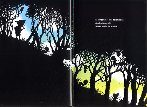
Image Link
Peggy Rathmann's heroic quest, The Day the Babies Crawled Away (2003), features a driving, rhyming cadence that is accompanied by illustrations that move the reader's eye from top corner left to bottom corner right. As such, the story tumbles along until the pattern stops abruptly when our hero and his infant charges get trapped at the bottom of a cliff. At this point in the story, the black frame of the page surrounds them on three sides, effectively holding them captive. Sadly, I could not find an image online to show the trapped scene, but I think you can imagine what I mean. Image Link
Anthony Browne's Willy is a nose-in-the book sort of fellow. No so, his friend Hugh, who attracts the annoyed stares of the other library patrons. The entire meaning of this illustration from Willy and Hugh (1991) is told by following the direction of the eyes. You may need to follow the image link to get the full effect of this one. And finally, here's one more marriage of motion (the font, the girl with arms uplifted) and direction (the buildings) acting in harmony. Robert Neubecker's Wow! City! (2004)
Colour has become a dominant design principle in illustrated books for children over the last several decades. Classics, such as Johnson's Harold books and McCloskey's Make Way For Ducklings or Blueberries for Sal, however, are evidence that illustration can be divine on a monochromatic scale.
From Blueberries for Sal (1948) Image Link
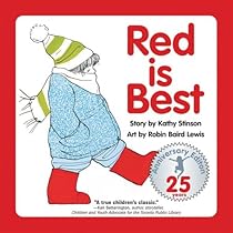
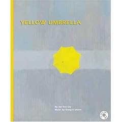
Other books, such as Richard McGuire's Orange Book (1992), which uses only the complementary colours of orange and blue, or Cathy Stinson's Red is Best (1982), which emphasizes the narrator's preferred colour, or the wordless picture book Yellow Umbrella (2001) by Jae Soo Liu deal in the essence of hue.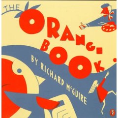
Hue is plucked straight from the colour wheel and comes in the infinite combinations of those three primary colours: red, blue and yellow. Bob Staake's The Red Lemon (2006)
 from Fish Eyes: A Book You Can Count On by Lois Ehlert (1990) Image Link
A picture can comprise mainly warm hues: a cross-section of the old white cabin in Delicious by Helen Cooper (2007) Image Link
Or cool hues: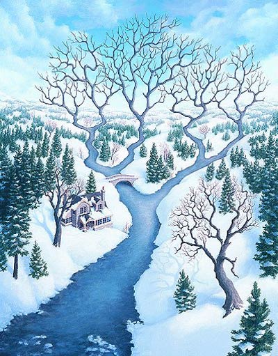 From Rob Gonsalves' Imagine a Place (2008) Image Link
Sometimes the lifeblood of the image is a pocket of warm colour lying in a sea or sky of cool: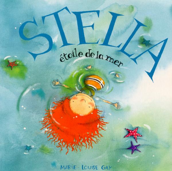 Marie-Louise Gay's Stella: Star of the Sea (English language version) (1999)
 Christopher Myers' Wings (2000)
Value refers to the amount of light or dark in an image and the interplay between them.
From Peggy Rathmann's The Day the Babies Crawled Away (2003) Image Link From Creation by Gerald McDermott (2003) Image Link
Whereas Beatrix Potter uses value to show the warmth of the hearth in winter,
Chris Van Allsburg plays with value to eerie effect in The Mysteries of Harris Burdick (1984), a suggestive, imaginative picture book for elementary aged children. Image Link
 Image Link
Ed Young's mice sparkle against their black backdrop in Seven Blind Mice (1992), and Image Link
Ted Harrison's depiction of the Aurora Borealis feels like stained glass, so filled with light are his colours. From O Canada (1992).
Saturation deals with the amount of grey that influences a colour. Image Link
In Janell Canon's Stellaluna (1993), the contrast of the bats who lack colour saturation with the highly saturated night sky provide maximum visual impact. The resulting ultra-realism emphasizes the vulnerability of the bats, creatures that the reader may not normally sympathize with. Image Link
In Knuffle Bunny (2004), Mo Willems splashes highlights of mid-saturated colours over top of black and white photo stills of a Brooklyn neighborhood to add a family atmosphere to the city backdrop. His illustrations often look like animation stills.
The use of water colours produces a canvas of lightly saturated colours. Image Link
In many books, and Barbara McClintock's Dahlia (2002) is a fine example here, such illustrations have a rural or old-fashioned feel to them, no doubt because they hearken back to the 19th and early 20th styles of early masters in the genre:
Randolph Caldecott Image Link
Kate Greenaway Image Link
Leslie Brooke Image Link
and Beatrix Potter Image Link
And then there is Norton Juster's Hello, Goodbye Window, illustrated by Chris Raschka, that conjures up a rustic nostalgia by using mid-saturated, high value colours.
 Image Link
If you want to see what Rashka has to say about his approach to illustrating this book, read the engaging caption he put on one of his pictures that was reproduced for the New York Times.
Raschka uses a similar style for a cover of the Horn Book Magazine. Deelish.
Highly saturated colours often, but not always, suggest an urban or contemporary setting, partly because contemporary printing technology allows for the mass reproduction of rich colours.Here is Raschka again with Yo! Yes? (1993)
 Vera B. Williams' A Chair for My Mother (1982). Image Link
Then there's the tropical feel of Dayal Kaur Khalsa' My Family Vacation (1988):
Highly saturated colours also feature prominently in many folk tales. Different colour combinations can be suggestive of different cultures or ethnicities: Leo and Diane Dillon's Why Mosquitoes Buzz in People's Ears: A West African Tale (1975)
 Ricardo Keens-Douglas' The Nutmeg Princess; illustrated by Annouchka Galouchko (1992) (a folk tale from Grenada)
 Gerald McDermott's Raven: A Trickster Tale From the Pacific Northwest (1993).
Phew. Colour dang near killed me. I hope you're still with me. We're coming down the home stretch.
Last but not least, we come to perspective and the two visual techniques that help to determine it: dimension and scale.
Dimension refers to the level at which a reader's eye encounters an image. Are we viewing the scene from on high? Are we looking up from the ground? Or are we meeting the image at eye level?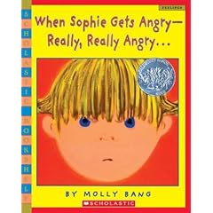 Molly Bang's When Sophie Gets Angry--Really, Really Angry (1999), shows the child reader what a temper tantrum looks like from a child's eye view.
 Image Link
When Sophie explodes, the dimension is eye level. When Sophie runs away and feels very small, the reader sees her as a speck on the landscape. By carefully manipulating dimension, the artist aligns the reader's sympathies with her character. Throughout the book we identify with Sophie and can therefore better empathize with her situation.
Now you tell me, in this illustration from David Wiesner's Tuesday (1991) are we meant to identify with the people who inhabit the town or the town's mysterious night time visitors? Image Link
Scale is similar to dimension but it is intrinsic to the picture itself rather than relying on the reader as viewer. Scale can simply let us know the size of one object relative to another as is the case in this picture from Wiesner's June 29, 1999: Image Link
And scale can sometimes make you smile: From David Shannon's Duck on a Bike (2002) Image Link
Alternatively, scale can convey the emotional crux of a situation. Take for example the day Willy the Wimp accidentally bumps into Hugh: From Anthony Browne's Willy and Hugh (1991)Image Link
______________________________________
In regaling you with examples of how the 11 design principles work in picture books, it was my hope that you would see how smart illustrations, when combined with visual literacy skills on the part of the reader, can contribute to the overall experience of reading a book. Do I kid myself that my daughter sees all this when she is looking at books?
No. Not for a second. But she does see a lot of things in illustrations that I don't catch right off. We also spend a lot of time talking about the pictures in her books in an effort to tease out both our ways of seeing. Books that are flatly illustrated don't allow us to open up the conversation. They don't influence our mood or emotions as we are reading. The really good books do, though, and each time I come back to those books to figure out why, the answer is usually right there in front of me in their finely crafted illustrations.
________________________________
OK, you all need a break from this so I won't post again in this series for at least a week if not longer. Truth be told, I need a bit of a break too. This was some hard work finding all those pictures and then making them fit my big picture. Next up, I'll be savouring the flavour of words. Mmmmmm, tasty words.
Monday, November 17, 2008
How to know when a book is superb: pictures edition, part 2
Subscribe to:
Post Comments (Atom)

24 comments:
In 'Tueday' it's hard to say. We are almost at eye level with the frogs, but we are looking at their backs as well as with them down onto the town. And the colour values in the town, the cool, moonlit blues, are distancing. I think we are supposed to see both the town and the visitors from a backlit vantage.
Oh, Mad, this is just amazing. Its so well organized and so well researched. You really make me think. Thanks a million.
I've always adored the illustrations to 'No, David' but I didn't ask myself why.
Audrey's brothers bequeathed her several 'Where's Wally' type books and she loved them from about 18 months on. She would look at and comment on each of the gazillion people who weren't Wally and had no interest in finding him.
Wowza!
I love these posts. I'm going to bring them up on our library's computer and just HAPPEN to show them to the librarian. Sans comments.
Maybe I shouldn't be writing this! hm.
Is the person who wrote Hello, Goodbye Window the same one who wrote The Phantom Tollbooth? I love that book!
NoMo: Yes. 44 years apart. He also wrote The Dot and the Line which was made into a cool animation back by Chuck Jones way back when. You know, back when I was born and Chuck Jones was king.
i've definitely noticed some of these elements in my kids' books. the deep colors often used in urban settings tend to really draw my children in.
this was great, mad!
Despite the sweaty flashbacks I'm having to an early class from this semester's Survey of Tech for the Library (*such* a catchy title) during which my professor elucidated these exact principles, I loved seeing the covers and pictures from some of our favorite books. Thanks, Mad!
One thing my prof said that resonated with me (who considers herself a verbal person, not a visual one) is that we are all aware of these design principles, because so much of our world--tv, books, magazines, etc--uses these techniques. We can't always articulate why we like the things we see, or what they mean, as we don't have the terminology for it, but we still use the criteria unconsciously to evaluate images ourselves because that knowledge has become innate.
And to think all I did on my blog this week was bitch about Stephanie Meyer... a pat on the back and a large martini to you, Mad, for putting this together. It's an amazing amount of work.
Can I just say I cannot believe "Red is Best" was published in 1982? That makes me feel old. It was my little sister's favourite book for years.
It's amazing that with the number of fantastic titles out there that people will still buy Isaac crap books based on Disney movies (your point from an earlier post, and a very good one).
I'm going to share these posts with my playgroup. Thanks again.
I love these posts, Mad. Wonderful stuff.
thank you, thank you. I am making Christmas lists right now.
Having just done a post with about 800 links, I greatly admire your 8000. Unfortunately, I had to click on them all to see the pictures. I hate with a white hot hate which could lead me to violence, er, am very frustrated with Windstream. We didn't have internet all weekend, and many times I can't call up pictures on blogs, mine included.
You are divine. I want to hang out in a library with you, pulling books off the shelf - hey, look at this! And, what about this?
Again, thank you.
mouth hanging open. i have taken entire courses - for credit - with less effort and insight put into them than this series, and we haven't even gotten to words yet!
i wish i was teaching this semester. i'd be plagiarizing all kinds of fab ideas. i'd ask nicely and credit you of course, but i'd still be plagiarizing.
Oscar and i found "Dinosaurs Roar" at the library this week...it put us in a good mood. and it was definitely the pictures.
I really wish Greg was reading this. he'd be so happy to see Chuck Jones in the comments section.
I love these posts, Mad--but I have to say--no Dr. Seuss! Any particular reason? (I'm just curious b/c Seuss is considered such a children's classic and it seems odd not to see him here.)
Andrea:
Fear not. For me Seuss is all about words and nonsense. He will come up.
On another note:
I will admit that I NEVER mention Seuss or Munch to undergrads b/c kids will find those books no matter what. I always try to lead education students to books they may not discover otherwise.
Actually, I lie. I do mention them to undergrads in that I spew out that above sentence before moving along with my session.
I had to come back to read this when I had time to really focus on it.
Wow. What an amazing feat!
Mad, I would totally take a class with you. Have you considered offering one? This would be great material for people interested in writing and/or illustrating children's books, as well as for people who like to read them.
I used to take art classes at a nearish museum (nothing is actually close to my home), and they once almost offered a course on children's book illustration. I really wanted to take it, but it was cancelled.
I really need to check out the Gonsalves books. I love surrealism.
I came back today to give this as much time as I needed, but I am being asked to assist the children with their water color painting. Maybe I'll provide some...who am I kidding? I'll be painting Batman with a plastic brush.
Tomorrow is library day this week. Can't wait!
Wonderful! I wish you were our librarian too...
By coincidence, my local library was displaying a book about the fine art of children's book illustratio - Show and Tell by Dilys Evans. I borrowed it, partly inspired by your post last week. The author explores the work of 12 illustrators.
I find your posts to be more organized, more thorough and comprehensive, and much more informative than the Evans book. Her review is also a little disappointing because she presents only American artists - completely ignoring talented Europeans, Canadians, Australians etc.
You are probably swamped with many other things in your life, but if you wanted to expand this series of posts into book format, I suspect you would have an appreciative audience. Thank you for the effort in providing such a thorough review - I'm eagerly awaiting the next in the series.
Thank you for this 'highly effective series about children's books'. Lots of new ideas for us. And, as with others some articulation of things we already love.
Yes, a martini for you and the power of your expertise.
This is stunning!
I think we need to pay you for all this work... or better yet, talk you into turning this into a book that you can sell and make tens and tens of dollars from.
That makes sense. I'm relieved to hear that you don't just think I have really bad taste!
I'll have you know, by the way, that I've spent at least $100 extra on christmas presents in the form of picture books as a direct result of these posts. So I guess they worked. :)
I am right now overwhelmed by the diversity of books that are available for our children. Plainly, our library sucks. We're better off buying other people's castoffs on the discount fundraising table. However, this does show the potential, the possibility. Thanks you.
love this, love it!
Really Helpful Guide for me. Thanks
A subject near to my heart thanks.
Great post.. love this one.=)
Post a Comment